
Blog written by Alejandro Paz
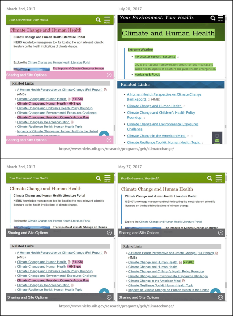
Lead image shows the HTML source code comparison for two versions of the same page, on which “greenhouse gas emissions and carbon footprint” was changed to “environmental footprint.”
Making a Public Dataset
For the past three and a half years, EDGI has been monitoring U.S. federal agency environmental webpages and documenting changes to these web resources. EDGI’s work has been enabled by tools it built for archiving, tracking, and rendering government webpages, which analysts use to identify and document instances of webpage changes they feel would be of interest to the public. The EDGI Web Monitoring team has published over two dozen reports on topics such as changes to climate change information online, and has documented around 1,200 important changes to the webpages it tracks. For a long time, the Web Monitoring Team has wanted to make its data on these changes public. However, to do so it needed to streamline its data by recataloging its records of these changes into a consistent classification scheme. In the summer of 2020, the EDGI Website Monitoring Team hired me, Alejandro Paz, to help review and reclassify the team’s dataset of documented webpage changes, as well as create a number of visualizations that contextualize the information represented in the data and the processes behind its collection. During this project, the Web Monitoring team and I encountered a number of challenges that reflected broader questions about representing changes to online content, designing and applying classification schemes to our data, and the usability of these kinds of datasets. As of the time of writing, the Web Monitoring team is still in the process of making this dataset public. We hope to publish it later this month. This blog represents an attempt to describe three central challenges to this project, and why it is such an important endeavor.
Three Challenges
As a recent graduate of Simmons University’s Library and Information Science program with an Archives Management Concentration, I felt I had an able understanding of how cataloging works, even in this unique format. In addition, my previous experience as a volunteer analyst with the Web Monitoring Team also helped me recatalog the changes documented in the dataset using our agreed upon classification scheme. I also put my previous experience processing archival materials and collecting online government information to good use. Even then, the Web Monitoring team and I ran into several issues along the way, some inherent to the necessities that come with engaging in government accountability research, others due to our unique approach to monitoring web resources.
Accuracy and Efficiency
Before we even began reclassifying changes in our dataset of important changes, we had to decide what the scope of the project was and how to approach our work so that we could publish the dataset within a reasonable timeframe. For the first year and a half of our monitoring efforts, we used a classification scheme that we had hoped would be compatible with machine learning and ultimately help automate the classification process. However, the data proved too complex for a dataset of our size to separate the signal from the noise. In mid-2018, we changed our classification scheme to be more streamlined and provide information that was more useful to our team for various analyses and pattern identification. In order to make our data useful and usable by the public, we needed to reclassify the first 18 months’ worth of changes we had cataloged using our first system. This consisted of nearly 2,000 changes that would have to be re-cataloged in accordance to our updated classification scheme. Thus, efficiency became a central concern in our reclassification efforts.
We made a number of decisions that helped expedite our work without sacrificing the integrity of our approach. One of these decisions was to set a maximum of a three-month boundary for the uncertainty of the timing of a change. To further explain, what the Web Monitoring team refers to as “webpage changes” are represented by two versions of the same webpage that are not identical. While most versions were archived just a few days apart, some had been archived more than a year apart. Whenever possible we found versions that were no more than three months apart that contained the documented change. The less time between two versions of a webpage that underwent a noticeable change, the likelier it is that the change observed in the webpage happened all at once at a specific time. Whether changes to a webpage occurred over a long period of time or in a single event represents an important difference.
To further explain, if a set of links on a webpage were all removed on the same date, it would be easier to describe these changes to a webpage as a single change, represented by one row (or record) in our dataset. In addition, one could understand the context of those changes more readily, for example, if there had recently been a repeal of a regulation that seemed to relate to them. On the other hand, if two versions of a webpage are different, but it is unclear when all the differences in the webpages manifested (at what time the changes happened), then describing the change to the webpage might become unwieldy and even obscure changes that happened at one point but were later reversed. It should ideally be the case that each recorded change does not actually represent several discrete changes to a webpage, which would better merit being documented individually. This concern was of particular importance because providing the most accurate time frame for changes is a time consuming process for our analysts. For myself in particular, if I were to have tried to gather the most precise time frame for every change first documented by a previous analyst, I likely would have never finished reclassifying the contents of the dataset. Thus, we decided to bound a single “change” or a single entry in our dataset as a difference between two versions of a webpage dated apart three months or less. This rule worked as a kind of compromise. It provided both flexibility to our analysts and ensured each webpage change we record is unlikely to represent multiple changes that happened at different times. This was but one example of our need to negotiate our capacity to review and categorize numerous changes with the desire to be as accurate as possible when describing these changes.
Categorization
As one can imagine by the previous example, the EDGI Website Monitoring Team had to deliberate carefully to come to an agreement on the way we classified changes in our dataset. There are not many existing guidelines that define best practices for documenting changes to webpages. Therefore, for this project, our team decided to redevelop its criteria for determining what is an important change to ensure it includes changes others would find relevant, and ensuring the criteria were applied consistently. Important changes (those that are found in our published dataset) consist of webpages where:
- Content related to the subject matter of the page has been added, removed, or altered.
- Language has been altered in a way that affects the focus or emphasis of the page itself or any issues discussed on the page.
- Links have been added, removed, their destination changed, or their textual description changed.
In addition, there are cases where changes that might seem to be important are for good reason not included in our dataset, such as updates to newsfeeds or events listings that merely insert recent news or remove outdated content. Other changes we do not include in our dataset are those that are predominantly infrastructural, administrative, or are expected to be dynamic content (e.g. rotating background images, event feeds, etc).
Besides distinguishing between important and not important changes, our dataset also categorizes changes by distinguishing whether there were changes to content or access to information, as well as the topic of a change. Of particular difficulty is determining what counts as a decrease versus increase in access, especially when multiple links are added and removed from a page at the same time. Our approach to this problem was informed by our previously drafted internal analyst guidelines, which I quote from here:
“An important change is categorized as the “Content Change” type if the most important changes to the page are in the information communicated on that page, either the substance of what is communicated or the language used to communicate it. An important change is categorized as the “Access Increase” type if links to new or additional resources have become available, and categorized as the “Access Decrease” type if links have been removed from a page or if the page itself has become restricted. An important change can be categorized as “Content Change + Access Increase” or “Content Change + Access Decrease” if there were substantial changes to both content and resource access.”
One might surmise these categorizations are quite subjective, and in fact they are. For example, if a change features substantially more decreases in access based on how many links were removed from a webpage, but features other link additions that seem to be of greater significance, it might be the case two analysts would categorize this change differently. This question calls back to the aforementioned issue of the capacity our volunteer analysts and I have for taking the time to provide accurate descriptive information for each change. We include “Notes” for each change as well, where analysts can further describe the nature of the change more, including if there were both additions and removals of links. A more robust and quantifiable definition of an “access change” might produce data that is more amenable to rigorous analysis, but it might also require spending an inordinate amount of time documenting some of the changes we observe.
With regards to which topic a change belongs to, our team built a list of topics from our categorization schemes and observations of previous changes. Our own internal documentation attempts to define each topic term we use, but ambiguous categorical situations tend to come up regardless. For example, a change consisting of the alteration of information related to carbon dioxide emissions from natural gas plants could be categorized as “Oil and Gas”, “Energy”, and “Climate”, perhaps even “Air” or “Economy” depending on the context. For the sake of constraining ourselves, we decided to limit each change to up to two topic designations. Although this solution might not be elegant, we believe this system provides enough information for someone unfamiliar with our dataset to be able to find and analyze changes to webpages that might be of interest to them.
Ease of use
Since people will approach searching the database differently, we wanted to provide various ways of finding information within it. One accommodation is to repeat certain information in our dataset. For example, for each change in our dataset, we provide the URL for the webpage, the name of the federal agency that manages its content, and the name of the webpage. Oftentimes, these three fields together contain redundant information. However, without having a clear idea how users might want to organize or filter our own data, we provide different options for searching through our dataset.
In the “About” page for the dataset we are currently building, we plan on including various visualizations that we hope will make it easier for people to understand what exactly is contained in our dataset and how we collected its information. Some of these visualizations cover the technical side of our web monitoring work, discussing our workflow and the role technology plays in it. Others attempt to contextualize our documenting of changes with policy changes that were happening concurrently.
Another important aspect of accessing our database is understanding how to make best use of the Internet Archive’s Wayback Machine to view webpage changes rendered side-by-side. Since the tools we use to render webpage changes can’t accommodate broad public use, the Wayback Machine is the best alternative for comparing different versions of the same webpage. Our hope is users can learn from our own documentation how they can use the Wayback Machine to visualize and analyze these webpage changes without running into technical difficulties.
Why is this dataset important?
There are questions about this project and EDGI’s Web Monitoring that linger in my head, especially as someone with my academic background. Is the history of the web (in this case environment-related U.S. federal government webpages) really history? How does one make the public notice when government information is altered, added, or removed online? And how might increasing public awareness about these issues affect the way agencies manage public information or the ways the public may engage with that information?
Speaking for myself, I can say that at the very least, EDGI’s Web Monitoring work has built a substantial record of the information policies and priorities of the Trump administration. Decades from now, no one will be able to deny there was a decrease in climate change-related terms used in government webpages or the removal of relevant regulatory information found online. We will be able to demonstrate that, rather than gingerly adjusting language to alter people’s perception of an issue, a primary Trump administration tactic has been outright removal of information from public view. I hope monitoring government information about the planet and its inhabitants’ health and letting the public know about it can promote accountability and make sure scientists can communicate openly about their findings. The availability of information provided by agencies such as the EPA should not be taken for granted, nor should we be naive about the potential for distortion of information driven by the agendas of political appointees. However, in this political moment, it remains to be seen to what extent public demands for more transparency and better access to government information can lead to change. The current coronavirus pandemic shows at least that government scientific information can become a central political issue if it is felt its availability and accuracy directly impacts people’s lives. We hope the tools and methods used by EDGI will help others have success in promoting accountability around these issues.
I would like to thank EDGI for valuing my expertise during this project, as well as their role in helping bridge my post-graduation career amidst the coronavirus pandemic. I would also like to thank EDGI volunteer Steven Gentry, whose help has kept this project on track to finish on time. There’s also not enough I can say about the webpage change rendering tools created by EDGI developers, which made examining these webpage changes a breeze after I gained enough experience using them.
Stay on the lookout for the publishing of the final dataset, which we hope will happen sometime during November this year!