Written by Steven Braun
As an information designer and visualizer of data, I am often tasked with an important challenge: developing a visual language to communicate the narratives expressed by the data with which I’m working. I typically respond to this challenge by deciding on a visual metaphor – a concept, symbol, or object, often taken from the natural world, that mediates the visual representation of a data set in ways that translate the abstract properties of the data into something that is tangibly reflective of its form. Selecting this metaphor is rarely a straightforward process but rather one that is lengthy and iterative, requiring the generation of new ideas which may be ultimately remixed or disposed of entirely.
I have done visualization work for EDGI in the past, including representing news coverage of EDGI events and publications. More recently, I was asked to visualize a collection of data produced by the Website Monitoring Team: statistics on the number of insertions and deletions of key climate-related language on federal websites between 2016 and 2018. In working on this visualization, I experimented with many visual metaphors and forms, culminating in Climate Frameshifts (https://www.stevengbraun.com/dev/climate-frameshifts/). It utilizes a visual metaphor of DNA structure decay and mutation to represent the shifting rhetorics yielded by those insertions and deletions of language. In this post, I explain the process which led to this metaphor and some of the iterative designs I produced along the way.
I begin any design process with observation. What do the data say? What are they trying but unable to express? How do they respond to the different ways we might touch or move them around? The goal is to identify those narratives intrinsic to the data and surface them in intentional, deliberate ways.
With this particular data set collected by EDGI, I found myself intrigued by the relationships between the insertions and deletions, the way they suggested an image of these webpages as decaying, fragmenting entities. I began by creating a simple visualization that imagined these pages as decaying strips of paper or “tape”; here, every vertical bar represents a single webpage, and the color and height of the bars indicate the percent difference in the extent of insertion (blue) or deletion (red) of a given term.
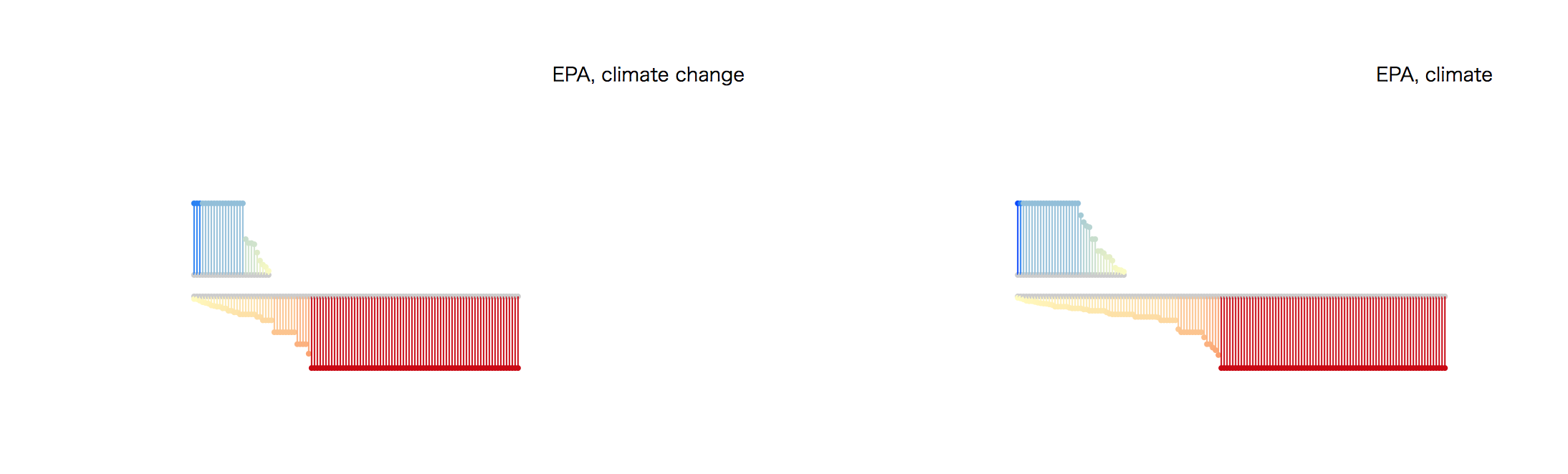
[Alt: Tape representation of insertions and deletions of climate-related language on federal websites comparing versions in 2016 and 2018. Red indicates deletions; blue indicates additions.]
After coming up with these versions, I decided to test a related but different form, this time wrapping the linear strips around an arc to make the representations more compact for those federal domains with a lot of websites.
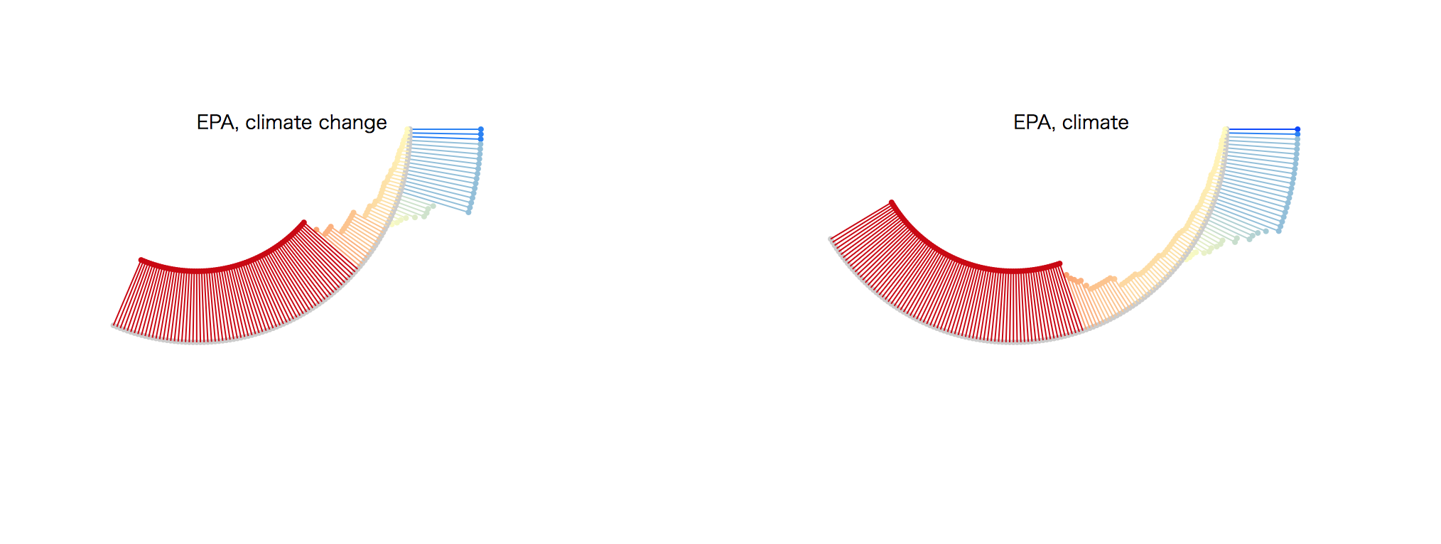
[Alt: Tape representation in arc form]
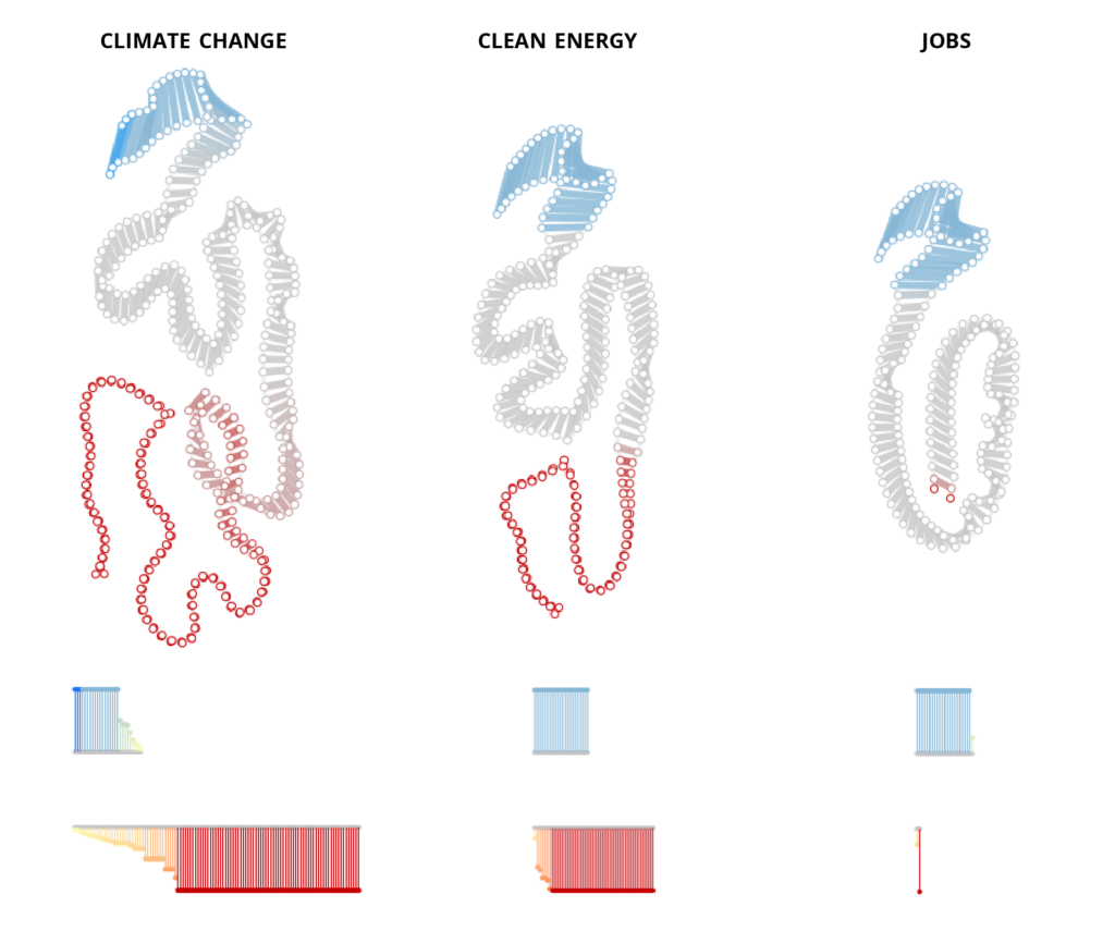
The more organic feeling expressed by this curved structure got me thinking about various natural forms and scientific concepts, a step toward finding a visual metaphor that reflected the climate focus of the data set. One form was of a petri dish, with the insertions and deletions represented as growing and shrinking colonies of bacteria. Another form, shown here, was of the energetic burst of a chemical reaction, a nod to the atmospheric science of climate change. In the example shown here, individual lines represent individual webpages, and the start point, end point, and length of the lines corresponds to the number of absolute insertions (blue) and deletions (red) of the given term.

[Alt: Burst representation of insertions (blue) and deletions (red) of climate-related language on federal websites between 2016 and 2018.]
This burst form had the advantage of showing absolute counts of insertions and deletions instead of just percent differences, illustrating the dramatic changes that have occurred across specific webpages. It also got me thinking about a new form: the structures and biochemical reactions of DNA.
In the same way that these webpages see insertions and deletions of language, DNA can undergo insertions and deletions in nitrogenous bases during replication. The consequence of reading these insertions and deletions in DNA replication is mutation, which changes the structure and function of the biochemical products that are created from the DNA. In a similar way, the language of these webpages is mutating as well. Where the structure of human language encodes rhetoric in the way that the language of DNA encodes biochemical markers that affect the function of the cell, these mutating pages result in mutating rhetorics that affect the structure and function of discourse around climate change.
The image below shows an early example of a visualization created using this DNA metaphor. Here, every “base pair” (pair of circular nodes with a line connecting them) represents a single webpage on the EPA website. The color and length of the connecting lines correspond to percent change of insertion (blue) or deletion (red) of the given term on those webpages. The tape representations, now representing not strands of paper but linear strands of DNA, provide another flat view of the data represented in the larger organic structure.
[Alt: DNA structure representation of insertions (blue) and deletions (red) of climate-related language on federal websites between 2016 and 2018.]
This metaphor offered a powerful representation of the ideas behind the data set. It offered the space to encode not only the changes in the webpages themselves but the larger consequences of those changes – the changes in rhetoric caused by shifts in language. With further refinement, this metaphor was turned into the final Climate Frameshifts project available at https://www.stevengbraun.com/dev/climate-frameshifts/.
The screenshot below shows example DNA structures for 5 federal website domains for the term “climate change.”
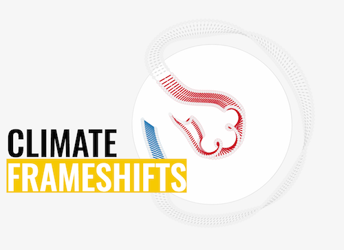
[Alt: Title screenshot of “Climate Frameshifts” visualization project.]
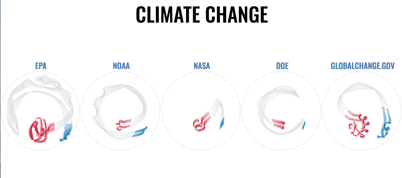
[Alt: Screenshot of DNA structure visualizations for 5 federal websites.]
Moving forward, there are additional visual metaphors that could be explored with this data set. One such metaphor under current exploration is of decaying footbridges that link the administration and the public via the shifting language and rhetoric of federal websites. Visualizations like these can help surface what is captured in these data in engaging ways, inviting the public to interrogate the data and question the language the Trump administration uses to discuss all things climate. This is, after all, one of the principal objectives of any visualization – to invite and open up discourse on narratives that would otherwise remain trapped in data sets that need a medium for expression.