Written by Harsh Baid. Reblogged with permission from Harsh Baid’s Blog: https://harshbaid.com/blog/2017/working-with-edgi/
Introduction
Over the past 3 months, as part of Google Summer of Code 2017 (GSoC), I spent my time working with the Environmental Data & Governance Initiative (EDGI). EDGI is a network of scientists, professors, and other non-profits that came together in response to the new administration and the threat they posed to several environmental agencies and public resources. EDGI essentially took that threat as a call-to-action and since then has been working diligently as a team on developing tools and resources to help preserve environmental data.
Over the summer, I became a part of that team. This was actually one of my first instances on truly working with an open-source organization and I have to say, it was awesome. Everyone at EDGI seemed very enthusiastic and determined about what they were building and that enthusiasm would trickle down onto newcomers (including me). Most open-source organizations have a hard time acclimating new users partially due to the learning curve that is involved when trying to contribute to a new project, but my mentors definitely helped close those gaps.
Data Models
Now to the fun stuff. My project focused on data visualization. The data being archived, while vital for preservation, was meaningless in the hands of the average individual and a bit overwhelming. So, over the summer, I worked on interactive graphs and models that helped users understand the general overview of the data.
Using D3, I created a Coverage Map and a DataRescue Map.
Coverage Map
EDGI had been archiving data from public resources since December of last year. Archivers.space (a data archiving workflow tool developed by volunteers) was using a tree graph to show coverage and while this helped display exact information on url and file structure, as the data count went from tens to hundreds of thousands, it became… messy. There was a disconnect between the information conveyed in the tree and what a user wanted to see.
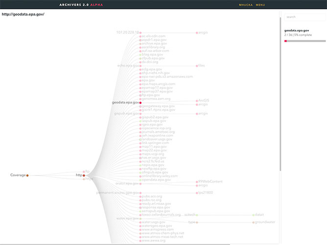
My first couple of weeks were focused on prototyping different models and obtaining feedback. I went through several variations of Bilevel Partitions, Icicle Trees, and whatever this thing is before finally settling on a Sunburst Diagram.
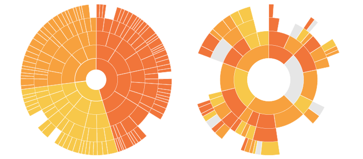
Sunburst Diagrams use concentric rings with divided arcs to show groups/categories with each layer denoting hierarchy. Digging further, I found a variation on the diagram called a Sequence Sunburst by Kerry Rodden in D3 which became a solid base to make the coverage map.
After getting it to correctly convert/process a sample JSON dump of the coverage data, I started polishing the model and creating a standalone ReactJS component. There were several issues that came up during this time that slowed down progress including:
- Color Schemes – Initially, we used a qualitative color scheme and displayed archival rate when the user hovered over an arc. We found this to be suboptimal and instead opted into a sequential color scheme for the entire diagram.
- Completion Rate – Each node gave us two values: numLeaves and numLeavesArchived. Archival rate was calculated using numLeavesArchived/numLeaves. Based on user feedback, the issue was whether numLeaves should be the node’s parent value or it’s own.
- Categorizing Data – Initially, the data was separated by protocol (https, http, ftp). While this was informative, it wasn’t particularly useful. We tried to separating it by website, but that too ended up filtering out ~97% of generated sunburst sequences because they were too small to display. We eventually moved on to filetype.
- React Integration – This was probably the most annoying one. Both D3 and ReactJS are designed in such a way that they want to directly manipulate the DOM. Of course, combining them means only one can.
- ArcTween-ing – Animating the diagram was challenging. Being new to D3, I had to figure out how to properly interpolate different arc lengths and animate the transitions between them.
Not all the issues listed ended up being resolved, but I hope to solve them in the near future as I continue to work on Coverage Map component as a whole.
Github Repo | Live Demo Coming Soon!
DataRescue Map
While web monitoring and archiving are a large part of EDGI’s focus, the organization also hosts several DataRescue events around the country with the goal of identifying and preserving different datasets. I always imagined it as a hackathon for archiving data.
Anyway, noticing that there was no effective way to view past events, I created a map projection of the United States highlighting interactive points across the country with DataRescue events. It was also directly integrated with the EDGI Airtable so the map updates live as new events come up. Working on the model came with it’s fair share of obstacles as well including:
- Optimization – This was a big one. A lot of the coordinate calculations, polygon rendering, and JSON processing for the map is dumped on the client. Decreasing the load time for the model became an issue and a lot of the testing involved alternating between using TopoJSON and GeoJSON data.
- Similar Datapoints – Events held in locations < 30 miles apart became an issue because the points were impossible to distinguish from each other on the map. A proposed solution was to aggregate nearby coordinates and increase the radius of the generated circle.
- Screen Size – This became an issue for many people viewing across different screens/devices. Due to limitations in the Albers’ equal area-conic projection, the map couldn’t be stretched. This made it harder for mobile users in particular to see the details of individual events. Users also had a hard time noticing that the text below the projection was changing
While some of these issues were left unresolved, I will continue to work on them and refine the chloropleth map in the near future.
Github Repo | Live Demo
Creating a Tool
Working with an open-source organization like EDGI and creating visualizations really widened my understanding of what made good software, good. If I were to summarize my entire experience at EDGI in one sentence: I learned how to make better tools.
When I initially started prototyping different models, the first thing I realized was that Mike Bostock is a genius; and D3js exemplified his philosophy on creating tools. D3’s API was unique because of the way that it compartmentalized big functions into much smaller ones. For example, instead creating a color scale using a single function, D3 first had me create the scale and then give it a range of color values. In more mundane terms, it was the difference between giving me a hammer and giving me the pieces to assemble my own hammer. While initially it would make sense to simply just give me the hammer, compartmentalizing each piece allowed users to change the tool to fit their own needs in creative ways.
Working with the library, creating models, and getting feedback from the wider EDGI community taught me a lot about how my initial assumptions on design choices were often misguided and that user feedback was key to refining the tools that I created. It was often the case that people from different backgrounds would have different experiences using the same model.
I also learned a lot about map projections and the issues that come with adapting vector points to a 2D surface, the geometry of the RGB color model and how it isn’t always the most intuitive or perceptually relevant model, and how long I could go staring at some source code before realizing that I was loading the wrong library… But that’s probably a blog post for another day.
Working with EDGI over the summer was awesome not only because of the people I met, but the new concepts I had learned. My mentors were a great resource to go to if I had any questions and definitely made me feel more welcome. I’m certainly not done refining the tools I built and I plan on staying at EDGI and continuing to work on them and other cool stuff in the near future!
Relevant Links
- Github Repo
- DataRescue Map
- EDGI Website