By: Ashok Sankaran, Christopher Cane, Taylor Stevens, Eric Nost, Naomi Yoder, Carly Hagen, Kim Barrett, and Shannan Lenke Stoll
Air quality monitors measure pollutants like particulate matter, ozone, and nitrogen oxides in the air we breathe—pollutants closely linked to public health. In the past, ways to measure air quality accurately and across many locations was a difficult task. But recently, inexpensive community-driven efforts have allowed underserved communities to do exactly this. Specifically, PurpleAir monitors (try checking out your local area on the linked map!) have been set up all over the world, providing air quality data for many communities including those that need it the most. This post isn’t intended to argue over the robustness or accuracy of these monitors. Papers such as this one have already established that PurpleAir monitors do meet the Environmental Protection Agency’s (EPA’s) air quality standards. Instead, we use a case study of air quality monitoring in Louisiana to show how data availability is necessary for the production of sound policy decisions.
A recent issue in Louisiana demonstrates the importance of air quality data. In May 2024, Louisiana passed the Community Air Monitoring Reliability Act (CAMRA), suppressing citizens’ abilities to share air quality information by specifying that “Community air monitoring programs… shall use the science-based standards set forth in 40 CFR Parts 50 and 58, including the NAAQS.”1 CAMRA also specifies that monitoring can only be done by “an Environmental Protection Agency-approved or promulgated emission test or monitoring method.” Though this sounds like a reasonable set of rules intended to bolster the data validity of air monitoring systems, this clause invalidates data collected by many community air monitors such as PurpleAir. This and other provisions of the Louisiana law also make it prohibitively expensive for communities without access to regulatory-grade air monitors to easily collect data. The only other widely used EPA-approved monitor is the EPA’s AirNow monitor, which can cost more than $10,000 to set up. Because AirNow monitors are so expensive, far fewer of them have been deployed nationwide compared to PurpleAir monitors.
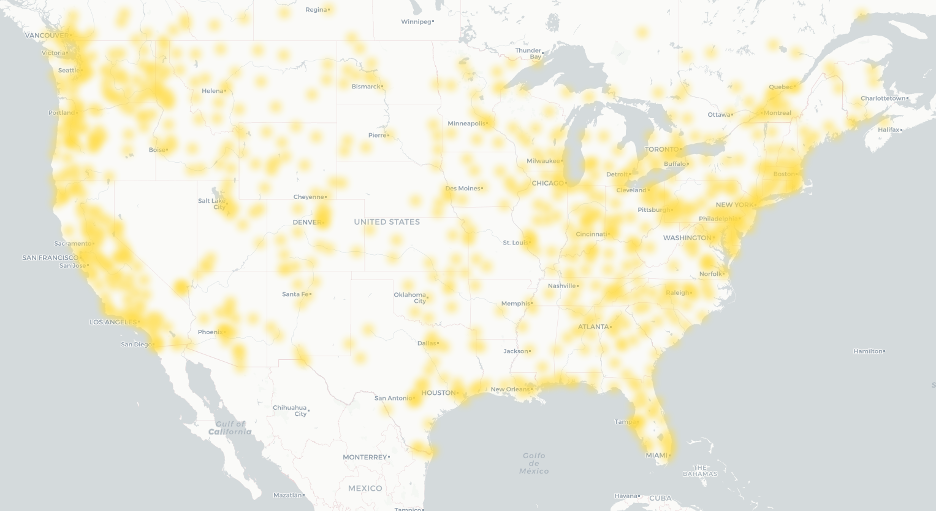
To demonstrate the need for community access to air quality data, we compared spatial heat maps of the distribution of AirNow versus PurpleAir monitors. Heat maps are typically used to visualize how data is concentrated spatially by using color gradients. We used a monochromatic color scheme for each sensor type to focus on geographic coverage. Figure 1 shows AirNow monitors’ coverage of particulates 2.5 microns or larger (PM2.5) in the contiguous US on July 13, 2025 (we used this same date for all AirNow maps).
Next we built a heat map displaying all PurpleAir monitor coverage of PM2.5 pollution in the US. For this dataset, we queried PurpleAir monitors active any time from July 13, 2025 to August 21, 2025. This gave us an idea of how national coverage looked when comparing PurpleAir and AirNow data from a similar time frame (Fig. 2).
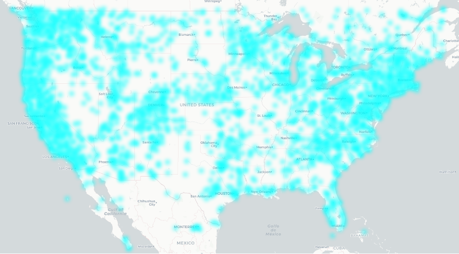
Comparing these visuals, we clearly see many more PurpleAir monitors than AirNow monitors. Even if PurpleAir monitors are less accurate than AirNow monitors, the PurpleAir network gives much more coverage, reaching areas that would otherwise be unmonitored.
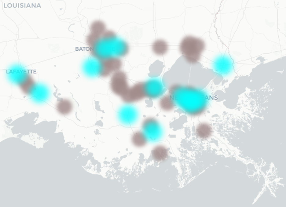
Next we zoomed in on a specific area to illustrate how data (or missing data) can tell a story. Below is a closer look at Southeast Louisiana, including major cities such as Baton Rouge, Lafayette, and New Orleans. This area also includes the infamous “Cancer Alley” (named for the presence of approximately 200 polluting fossil fuel and petrochemical facilities) lining the banks of the Mississippi River from Baton Rouge to New Orleans. Figure 3 shows AirNow’s coverage of the area.

To compare this to PurpleAir’s coverage at the same geographic scale, we displayed all PurpleAir monitors, including inactive ones (inactive monitors were not included in Figure 2).2 This is shown below in Figure 4. Active sensors (defined as those taking measurements within 24 hours before the dataset was obtained) are indicated in blue, while inactive sensors are shown in gray.
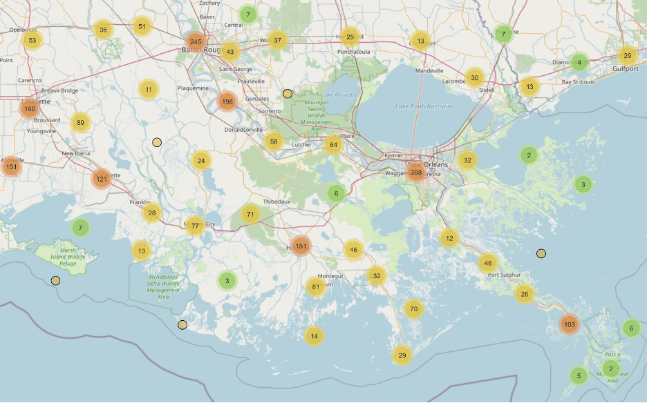
In addition to the national coverage, the coverage in Southeast Louisiana looked quite different between the AirNow and PurpleAir networks. Before we zoomed in a final time, we also considered a map of industrial facilities in the area, shown in Figure 5.
It’s immediately apparent from Figure 5 that there is no adequate air monitor coverage, even by PurpleAir’s network, around the staggering number of polluting facilities in Southeast Louisiana.
Digging deeper into statistics of industrial facilities, we used a proximity analysis to show that AirNow monitors are nearly 25% farther than PurpleAir monitors (12.74 miles and 10.23 miles away on average, respectively) from the nearest “major” (i.e., large) air pollution point-source4 facility regulated by the Clean Air Act (CAA). Additionally, out of 16,336 point-source CAA-regulated facilities in the contiguous US, there are 5,701 facilities where the closest air monitor (of the two networks) is AirNow and 10,635 facilities where the closest air monitor is PurpleAir. In other words, only about 35% of the facilities have an AirNow monitor closer than PurpleAir, whereas 65% of facilities have a PurpleAir monitor closer. In some places, like Southeast Louisiana, many facilities are far from both AirNow and PurpleAir networks, as seen in Figure 6 below.
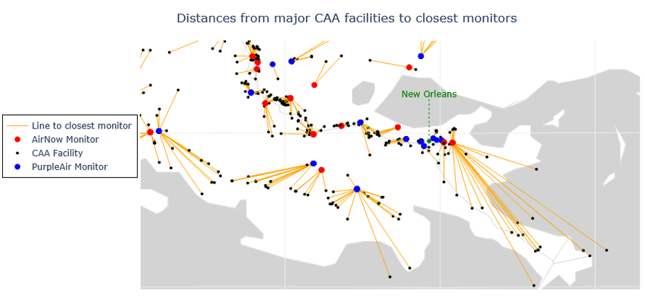
Nationwide, the distance from any CAA facility to the nearest PurpleAir or AirNow monitor averages over nine miles, with some facilities over 130 miles from any monitor. Even nine miles can be too far to measure fenceline air pollution from a facility, showing a deeply concerning gap in information vital to public health, community self-determination, and the enforcement of environmental laws. As CAMRA and similar policies widen these gaps, it is important to preserve and expand both PurpleAir and AirNow networks. Without adequate data, disproportionately affected communities facing more air pollution (especially communities with lower incomes and more people of color) are less likely to receive reparations or justice. According to the Climate and Economic Justice Screening Tool (CEJST), just 4462 air monitors (of any network, not just PurpleAir or AirNow) are in disadvantaged areas (i.e., Census tracts), which is around 20% of all monitors. Comparatively, 38.5% of all Census tracts in the US are considered “disadvantaged” according to the thresholds laid out in CEJST, showing disadvantaged Census tracts are underrepresented by air monitor coverage.
We then focused on the greater New Orleans area, overlaying industrial facilities onto the heat map of air monitors (Figure 7, where AirNow is on the left and PurpleAir on the right).5
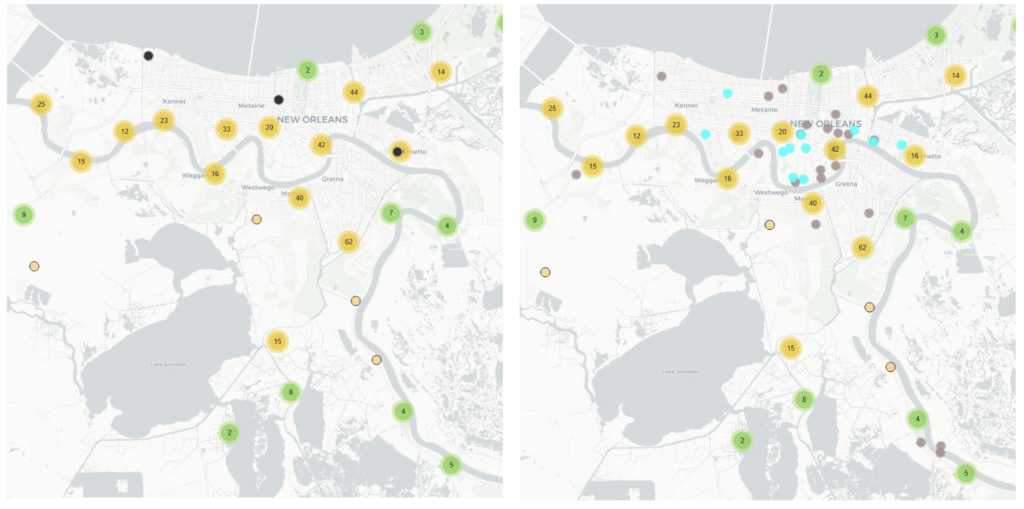
At this scale, the disparate coverage between the two networks is extremely apparent, with only three AirNow monitors compared to 11 active and 20 inactive Purple Air monitors. To better understand how important this coverage gap is, we looked at an interesting cluster of inactive PurpleAir monitors in the southeast area of the PurpleAir map in Figure 7.
These three inactive monitors once tracked pollution in the communities of Ironton and Phoenix, where companies like Phillips 66 built refineries and factories such as the Phillips 66 “Alliance Refinery”). In the wake of Hurricane Ida in 2021, both the Alliance Refinery and the air monitors were seriously damaged. Alliance Refinery closed for months amid flooding and near-constant flaring at the facility (Fig. 10), and there was no air monitoring to track the emissions. A few months after landfall, Phillips 66 announced plans to shutter the refinery operations for good and convert Alliance Refinery into an oil storage facility, endangering jobs and abandoning the environmental damage that resulted from Ida or caused by decades of polluting factory operations, leaving local residents to deal with the aftermath.
Monitoring Ironton and Phoenix with AirNow monitors is a venture neither the Parish nor local residents could afford, and Louisiana’s passage of CAMRA was a fatal blow to residents’ remaining ability to use the data they already had through PurpleAir monitors. Just downstream of Ironton, there is now a massive (and massively polluting) liquified fossil gas export facility, so the area still suffers from extensive air pollution. Many communities around the nation struggle with a similar situation, where the regulations in place do not give fenceline residents a viable, affordable, and accessible option for monitoring environmental impacts.
In a world where the impacts of climate change are only going to get worse as temperatures continue to rise, it’s imperative to enable areas like Plaquemines Parish to conduct the monitoring that they desperately need. Communities need to understand what’s actually in the air in order to most effectively advocate for better air quality. If state and federal agencies have permitted these industrial polluting facilities, shouldn’t they also, at the very least, invest in the surrounding communities’ ability to monitor their air?
Appendix
Plaquemines Parish Demography and Its Legacy of Environmental Injustice
One area we examined closely is Lower Plaquemines Parish, shown in the bottom right of the maps in Figure 7. This parish experienced racial segregation and economic and environmental injustice from as early as 1706. Under French (1699-1703) and Spanish (1763-1803) colonial occupation, the region saw violent conflicts—both between the French and Spanish colonists and between the colonizers and Indigenous communities. Survivors of murderous raids on local Indigenous groups were often brutally enslaved, despite showing the colonizers how to survive in the harsh ecosystem (Rushforth 2012). The first African people kidnapped, trafficked, and enslaved by European colonizers and enslavers arrived in Louisiana in 1710. Chattel slavery continued well into Louisiana becoming a territory of the US and during the subsequent Civil War. This was eventually followed by sharecropping (for agricultural plantations and the seafood industry alike) and Jim Crow laws curtailing the rights of formerly enslaved people until the Civil Rights movement began dismantling them in the 1950s and 60s. The actions of white supremacist and segregationist leaders, such as Leander Perez (of Plaquemines Parish and St. Bernard Parish) resulted in severe economic consequences for the lower Plaquemines Parish community.
Perez was a political figure, judge, district attorney, and President of Plaquemines Parish Council, wielding significant power in the area. Perez was a white supremacist that didn’t hesitate to push authoritarian policies—his “good ol’ boy” business practices meant exploitation of the working class, racialized economics, and corrupt political, legal, and industrial practices that paved the way for the fossil fuel and chemical industries that now pollute the very communities he claimed to work for. Perez suppressed civil rights voices in the 1950s and ‘60s by threatening to jail civil rights workers. Responding to a question about how many people could be incarcerated at a Spanish fort repurposed as a prison, Perez explained, “There’s no limit in number. If they choose to come in tens and twenties, we’ll take care of ‘em. If they choose to come in hundreds, we’ll pack ‘em in here, just the same.” The rhetoric and policies of the Trump administration are alarmingly similar to those of Perez, and similar to Perez also exacerbate environmental injustice. Other white supremacist leaders, such as David Duke (former KKK “grand wizard”) have followed similar playbooks to political power in the southeastern Louisiana region, partnering with industry and white supremacist networks to fuel their campaigns. This lineage of environmental injustice and racism precedes the exploitation of Plaquemines Parish workers and attacks on community environmental monitoring experienced today.
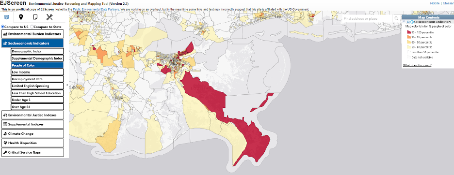
With a population of approximately 23,000 people today, Plaquemines Parish remains ethnically and ecologically diverse today. French-speaking Cajuns, Isleños from the Canary Islands, African Americans, and Houma, Chitimacha, Choctaw, and Atakapa-Ishak/Chawasha are some of the groups that live in Plaquemines, and from which the contemporary residents descend.6 Though the US Census shows that the population of Plaquemines Parish is predominantly white, demographic maps of the Parish show a segregated Black rural and white urban divide. The most densely populated part of Plaquemines Parish is the “upper Parish” which is close to New Orleans and predominately white.7 The more rural “lower parish” area, especially the east bank of the Mississippi River, are predominantly people of color (Figure 9) and disproportionately Black as compared to the rest of the state or Parish. The lower parish area is also home to the mouth of the Mississippi River, and there is no shortage of CAA-regulated facilities (see Figure 5).
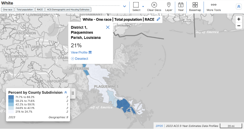
EPA’s EJScreen (Environmental Justice Screening and Mapping Tool V 2.3 2024) demonstrates that the more rural parts of Plaquemines Parish have percentages of people of color in the highest 5% nationally (Fig. 9).
Demographically speaking, who is “covered” by each air monitoring network in this part of Louisiana? Who lives closer to CAA-regulated industrial facilities? Using added functionality to EJScreen, we employed EPA’s Environment Justice Analysis Multisite tool, (EJAM), to respond to these questions.
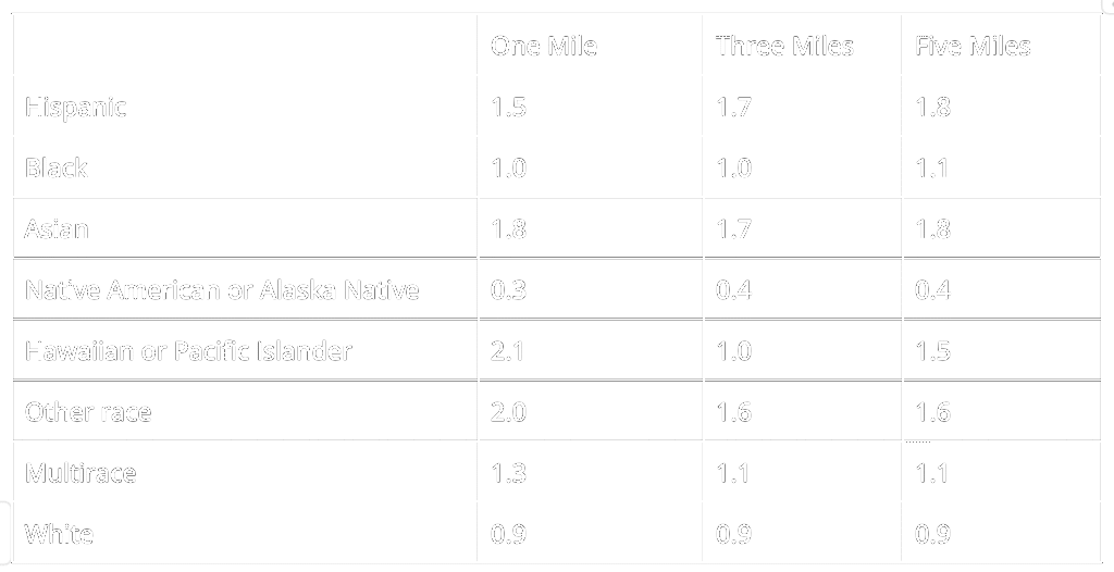
The areas closest to PurpleAir monitors (i.e. one mile radius from them) have the same proportion of Black population as the demographic makeup of Louisiana as a whole. There are slightly fewer white people, proportionately, close to PurpleAir monitors, in Southeast Louisiana, than there are in the state (Table 1). These same areas cover less of the “Native American or Alaska Native” population relative to the rest of the state, but more of the “Asian,” “Hawaiian or Pacific Islander,” “multirace,” or “other race” populations.
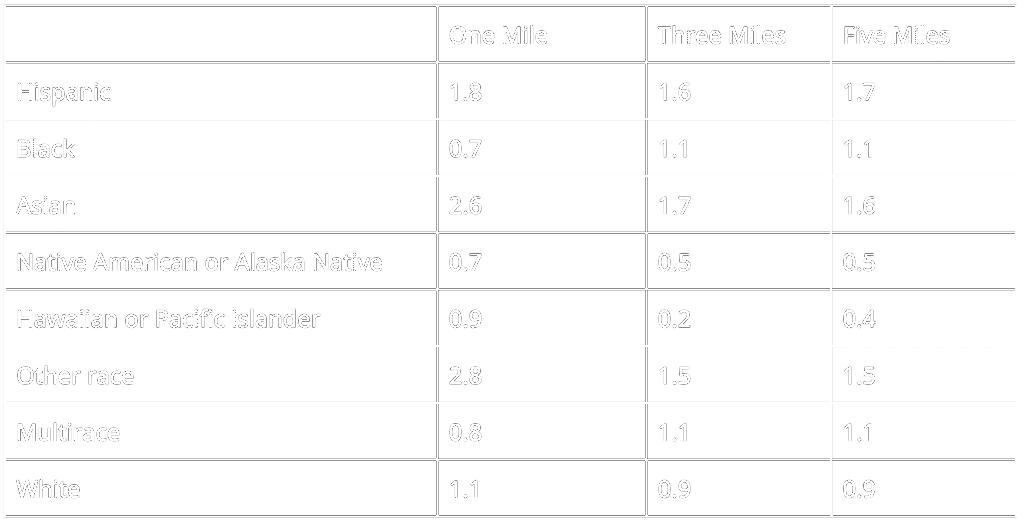
Table 2 indicates that within one mile of AirNow monitors, the population is slightly disproportionately white relative to the state (1.1), while Black communities are underrepresented (0.7). This is essentially inverted as the search area is expanded from one to three to five miles. With both PurpleAir and AirNow, Indigenous people (“Native American or Alaska Native”) are disproportionately underrepresented as compared to the statewide population.
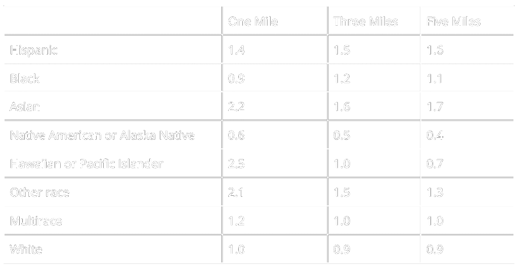
Finally, we performed the same analysis for CAA-regulated facilities in the region. According to EJAM, all categories except Black, white, and Native American or Alaska Native are disproportionately higher near CAA-regulated facilities in southeastern Louisiana when compared to the state (Table 3). The white population within one mile of CAA-regulated facilities in southeastern Louisiana is evenly proportional (1.0) to that of the entire state and declines slightly at three (0.9) and five (0.9) miles. The proportion of the Black population is slightly lower than 1:1 at one mile from CAA-regulated facilities in Southeast Louisiana as compared to the state, but the proportion of Black people increases to just above the state average at the three (1.2) and five (1.1) mile distances.
- NAAQS refers to the National Ambient Air Quality Standards. [↩]
- Note: we included inactive monitors to attempt to convey the scope of monitors that have ever been available to communities near polluting facilities. Also, some monitors will be classified as “inactive” despite being only temporarily offline for maintenance or repair. The AirNow network does not provide locations of historical monitors. [↩]
- There are more facilities listed in this map than the 200 referenced above for Cancer Alley, because this map includes smaller facilities that don’t necessarily have the same permits for pollution as major facilities do, and because there isn’t good consensus on what constitutes a “facility” in any industrial corridor like Cancer Alley. [↩]
- Point source refers to a stationary source of pollution, like a set of flare stacks at an oil refinery, as opposed to diffuse sources like highway traffic. [↩]
- The radii of heat map points in Figures 1 to 4 were enlarged for visual clarity. This enlarged view doesn’t represent the true coverage radius of each monitor. At the zoom level in Figure 7, we displayed sensor placement in the region as smaller points instead. [↩]
- Zviers, 2024; https://fpcclouisiana.org/; https://native-land.ca/. [↩]
- People of Color in EJScreen refers to anyone who is not white, where “white” includes people who list their race as white and their ethnicity as not Hispanic. [↩]